Tutorial Resources
- Professional killer on the street – Depositphotos.com
Step 1
Open the Image.. You can get the image here
Step 2
Right-click on the layer then click Convert to Smart Object. This will convert the layer into a Smart Object which lets us manipulate the image non-destructively.
Step 3
Before we start, we’re going to add a black layer below the photo layer. To do this, go to Layer > New Fill Layer > Solid Color. Select black as the color then click OK.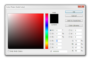
Step 4
In the Layers palette (Window > Layers), drag the Color Fill layer to the bottom. Rename the top layer to Photo and bottom layer to Background. To rename a layer, double-click on the text of theStep 5
To begin, we’ll add a gritty photo effect with adjustment layers and filters. Start by adding a Black & White adjustment layer (Layer > New Adjustment Layer > Black & White) then change the blending mode of this layer to Overlay. Feel free to play around with the settings in the Properties panel (Window > Properties). This is an easy way of adding a grungy lighting effect and you can try it with your other photos.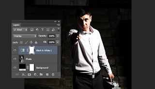
Step 6
Next, add a Vibrance adjustment layer (Layer > New Adjustment Layer > Vibrance). Reduce vibrance setting until it just has a hint of color.Here’s what our image looks like after reducing the vibrance setting.
Step 7
The adjustment layers gave it a grungy lighting effect but it also hides the detail and makes the background even darker. We don’t want to the photo to be too dark because it can blend in with the black background and make the stripes not very visible. To fix this, we’re going to apply a Shadows/Highlights adjustment. In the Layers panel, select the Photo layer then go to Image > Adjustments > Shadows/Highlights. Set the shadows to around 35% and highlights to around 15% then click OK.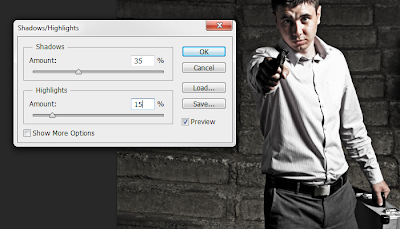
If you look in the Layers palette, you can see that the adjustment was applied as a Smart Filter. This is because in Step 2, we changed the layer into a Smart Object. The benefit of using Smart Filters is that you can change the settings at any time without undoing a bunch of steps.
Step 8
Next, we’re going to add some grain to the photo using the Add Noise filter – which will be applied as a Smart Filter just like the previous step. Make sure you have the Photo layer selected then go to Filter > Noise > Add Noise. Checkmark the Monochromatic option then adjust the settings so that you get an effect like shown in the image below. Click OK to add the noise.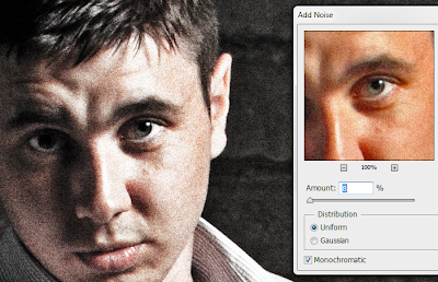
Step 9
Next, we’re going to crop and rotate the image. Select the Crop tool (C) then in the options bar, disable the “Delete Cropped Pixel” option. This will let us uncrop or make adjustments to the crop at any time.
Crop the image like shown in the image below. We also rotated the image
so that the eyes are more horizontally aligned. This is important
because when we add the stripes, we want to ensure that the eyes are
visible and don’t tilt off the top or bottom edge of the stripes.
Step 10
Now we’re going to add some text to the image. We’re doing this first so that we know where to place the stripes later. In the Layers palette, select the top layer so that when you add the text, they all appear above the top layer. Select the Text tool then add some text around the image with each line of text in their own layer. The font used below is Arial.Step 11
Select all the text layers (hold CTRL to select multiple layers) then add them to a group (Layer > Group Layers or Ctrl+G). Rename the group to Text.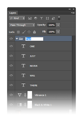
Step 12
Group the layers associated with the Photo layer (Vibrance, Black & White, & Photo) then rename the group to Photo.Step 13
Now we’re going to add the stripes. This is really easy to do and the only tool needed is the Rectangular Marquee tool. Select the Rectangular Marquee tool then in the options bar, set the mode to “Add to Selection” which is the second button to the left. You can hover over the icons to see what each one does. Also, ensure that your feather setting is set to 0px.Draw some rectangles like shown in the image below. Start by drawing rectangles around the text and eyes then adding more afterwards. If you make a mistake, just press Ctrl+Z to undo. Want to start over? Press Ctrl+D to deselect and start over.
Step 14
In the Layers palette, select the Photo group then click on the Add Layers Mask button. This will create a layer mask from the selection you made in the previous step.Step 15
We’re almost done! Select the Rectangular Marquee tool and create selections around the text. Make sure your foreground/background colors are set to the default white/black by pressing D to reset the colors. Press Delete to fill the selected area with black. Press Ctrl+D to deselect.Step 16
In the Layers panel, click on the layer mask of the Photo group – make sure you’re clicking on the thumbnail so that you are editing the layer mask.Press D on your keyboard to reset your foreground and background colors then press delete on your keyboard. This will fill the selected area with black. Press Ctrl+D to deselect the selection when you’re done. Here’s what our image looks like.


Tidak ada komentar:
Posting Komentar